 |
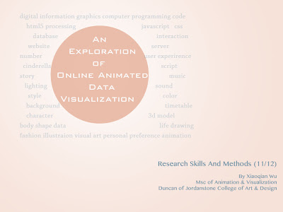
| The cover of the powerpoint |
The Research Problems:
- How to make data easier to understand by visualization?
- Can data visualization be animated instead of just static display?
- How to apply the new computer technology to create better data visualization?
Context:
Data visualization is the study of how to communicate information in a clear and effective way by graphic methods(Fry+Oram, 2007).
We are living at an information explosion time, but to many non-professionals, so much data is a disaster because they are hard to read and understand. Most of the time, people are trying to understand the meaning of the data instead of the numbers. That's why we need visual design to help the public to get the content of the data.
As for the exploration of data visualization, traditional visual artist like Woolman argued that 'The root of information visualization is in graph drawing'(Woolman,2002); This focus on static graphic method certainly help people to understand the relationship and meaning of the data, but it's not flexible enough to represent the change of the information if its data is dynamic.
Ben Fry, who is a consultancy of design and software, proposed another theory for this kind of visualization. He stressed the importance of the interaction and change between data and users. Base on this theory, he summarized seven steps of data visualization, which are “acquire-parse-filter-mine-represent-refine-interact”(Fry,2007). These steps provided a very practical method of data display and also the possibility to allow user to communication with the data.
In the case of this project, which aimed at using the story background of Cinderella to build an online data visualization website, with the new technique HTML5 to draw the canvas, also involve Maya 3D modeling and 2D drawing, the seven-steps-method that Fry suggested is inspiring; it somehow involves all the needs and stakeholders through the visualizing process, and it's easy to reuse in other visualization cases, such as an online HTML5 information animation.
Outcome:
Aimed at helping people understand themselves better by interacting with certain data, this project focuses on the data relative to personal interest. The outcome should be easy to access and simple to operate, and suitable for a planned online animated data visualization website.
The research and practice are relative to the areas of visualization, fashion and computer programming.
Research Methods:
The research will use the following research methods:
- Storyboard, which will simplify the data to be presented and clarify how to visualize it;
- Visual diary, which will be helpful to collect inspiration and build up the visualization ideas;
- Computer simulation, which will permit experiments to understand the possibility and limits of the new technologies used in the project, such as Javascript and HTML5;
Timetable:
- September - November 2011 (Program Learning of Maya and Life Drawing, Research on Technology and Fashion, Experiment on Web programming, data analysis)
- December 2012(script and storyboard, experiment on website)
- January - February 2012(Character Design, 3d modeling, work on the website)
- March - June 2012(background design, animation, sound, build the website)
- July - August 2012(music and sound, editing, coding and test of the website, poster)
Reference:
- Ben Fry and Andy Oram (ed.) (2007) Visualizing Data. United States of America, O'Reilly Media, Inc.
- Matt Woolman (2002) Digital Information Graphics. London, Thames & Hudson Ltd.
- Peter Lunbbers, Brian Albers, and Frank Salim (2010) Pro HTML5 Programming:Powerful APIs for Richer Internet Application Development. United States of America, Apress.
No comments:
Post a Comment